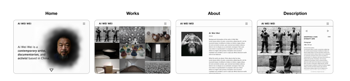
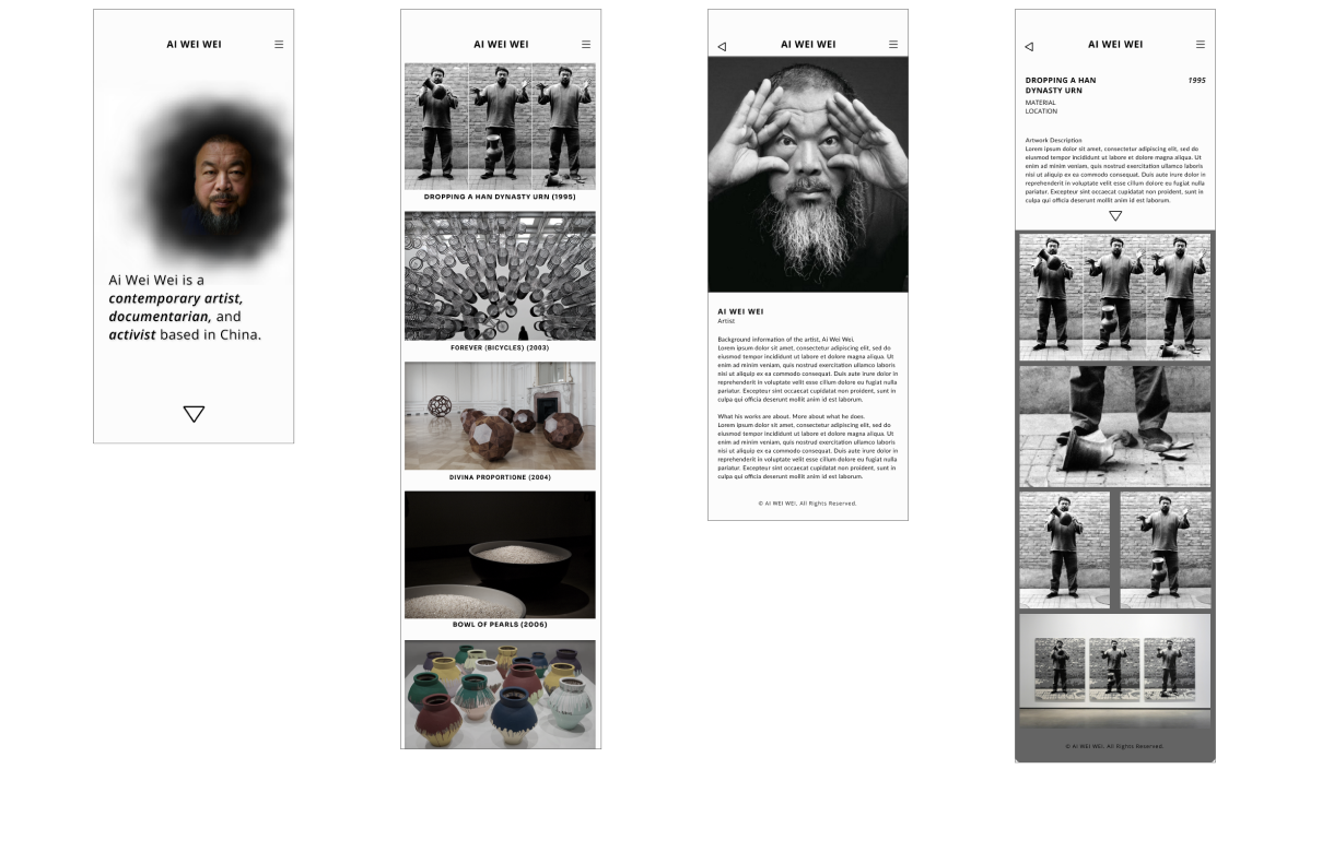
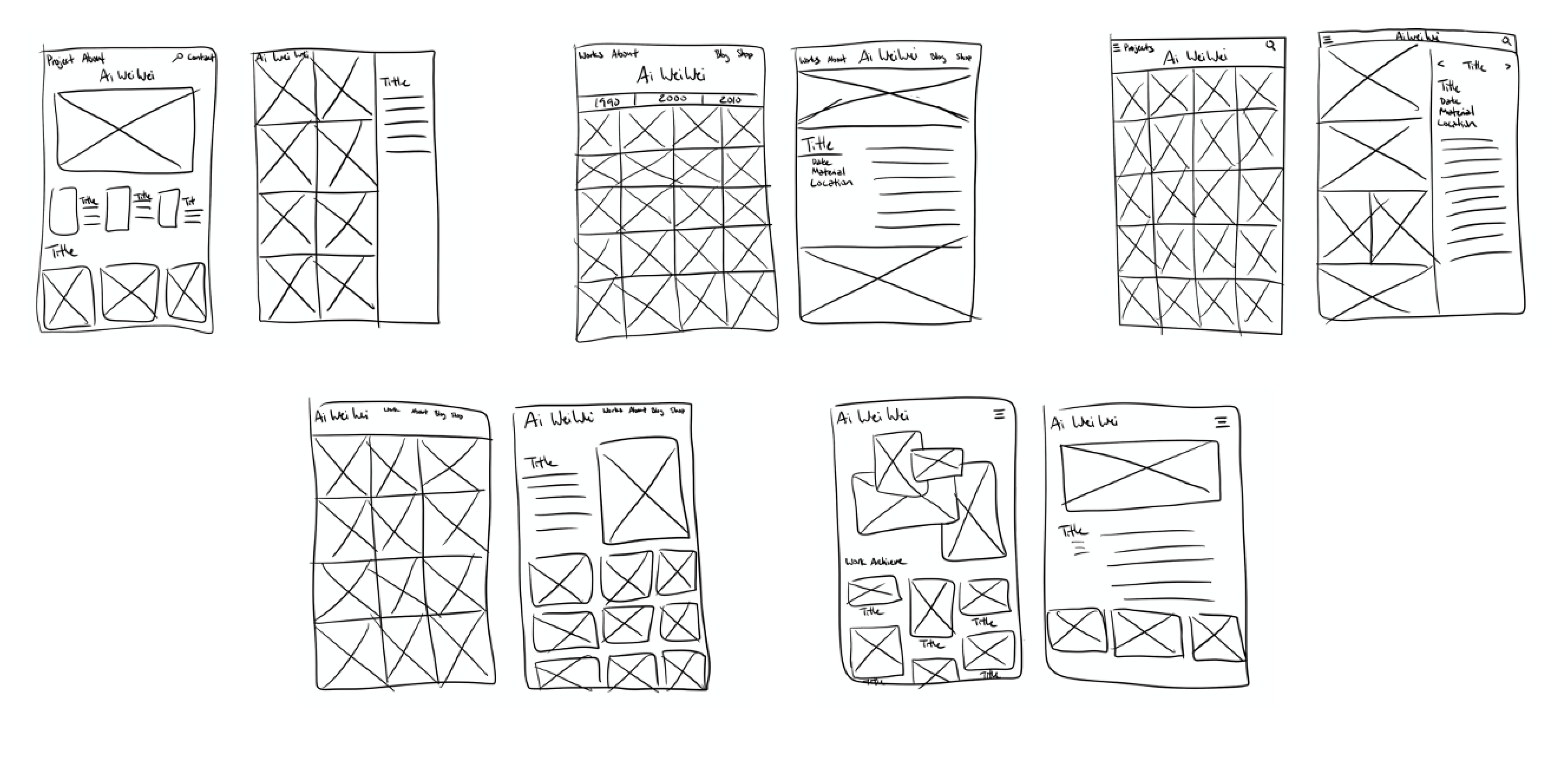
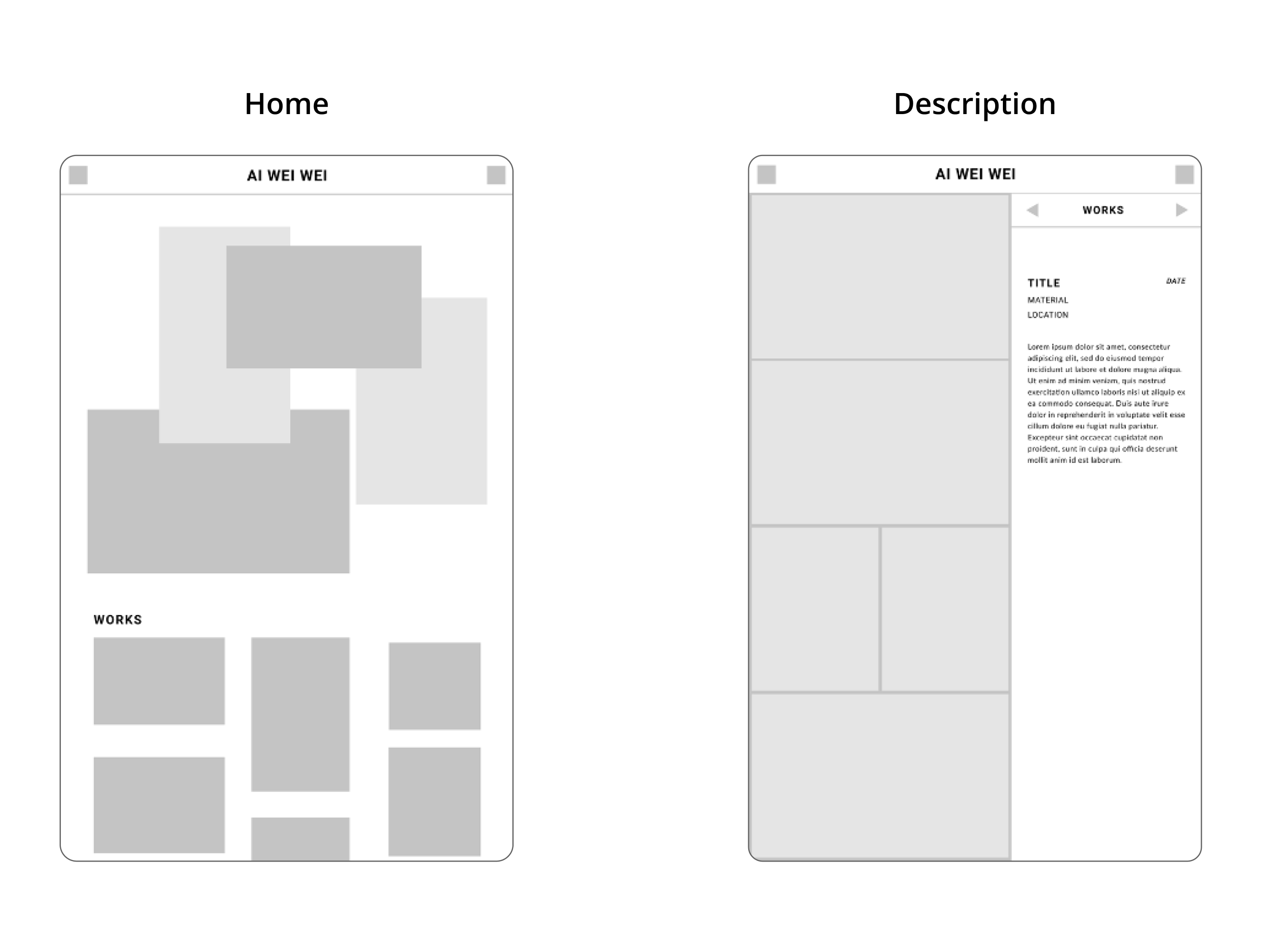
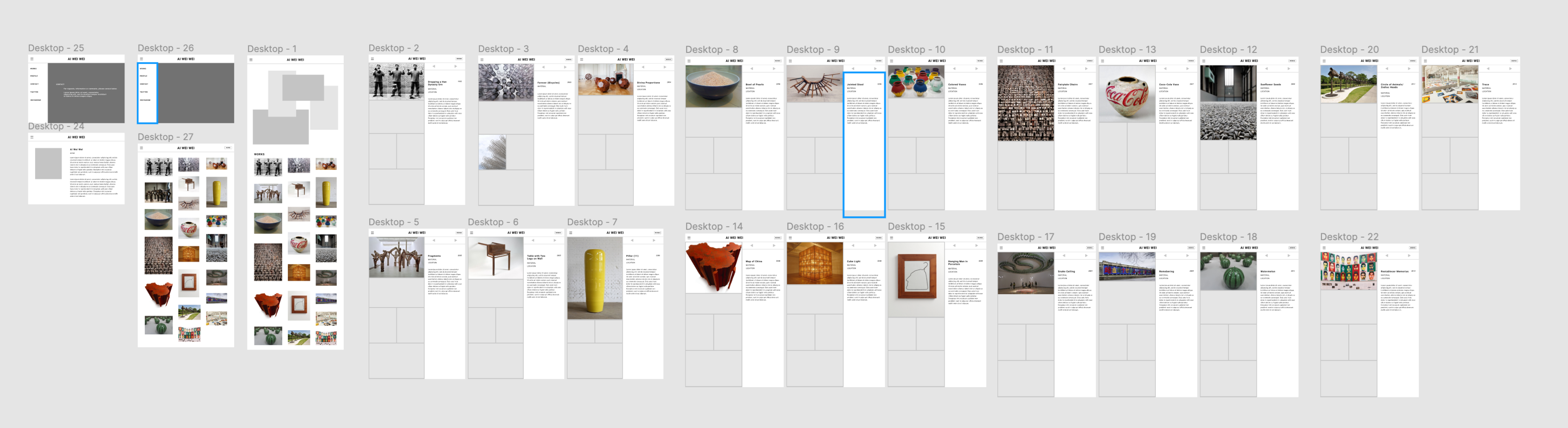
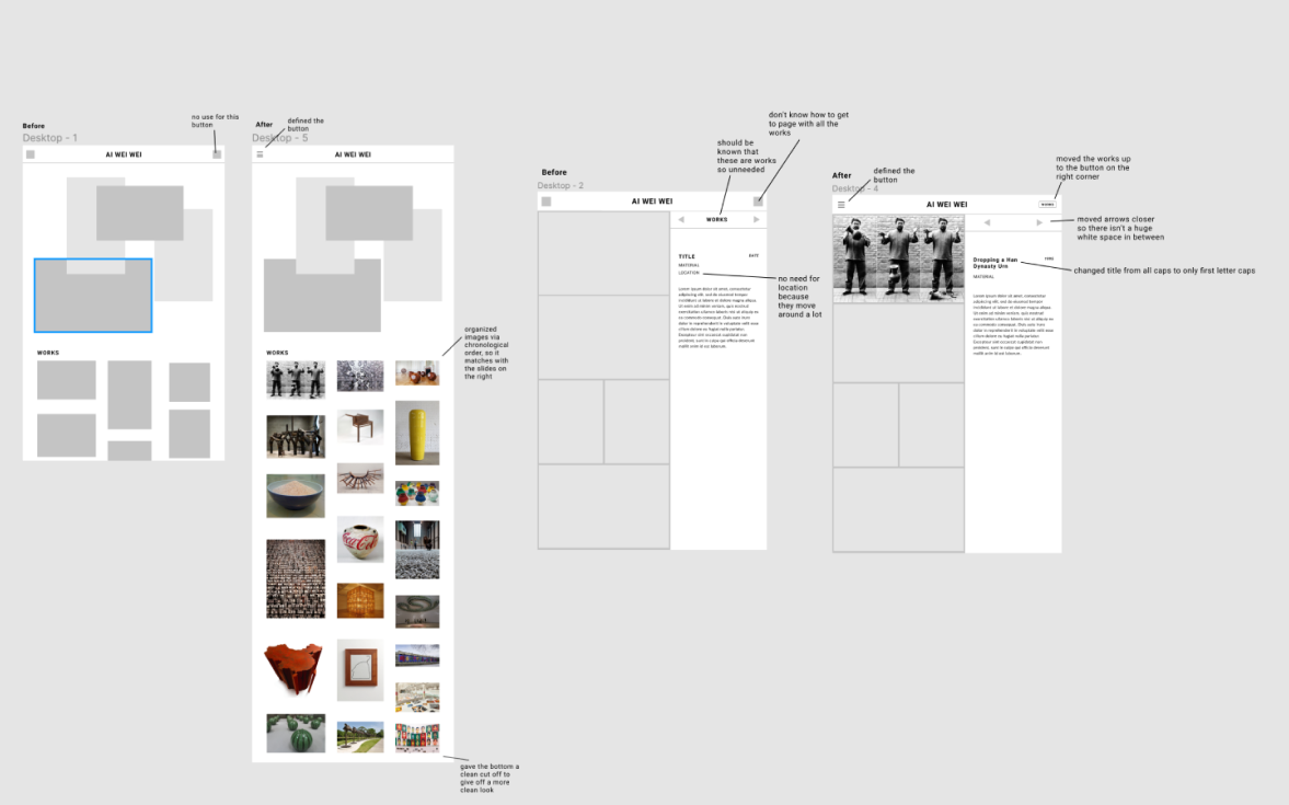
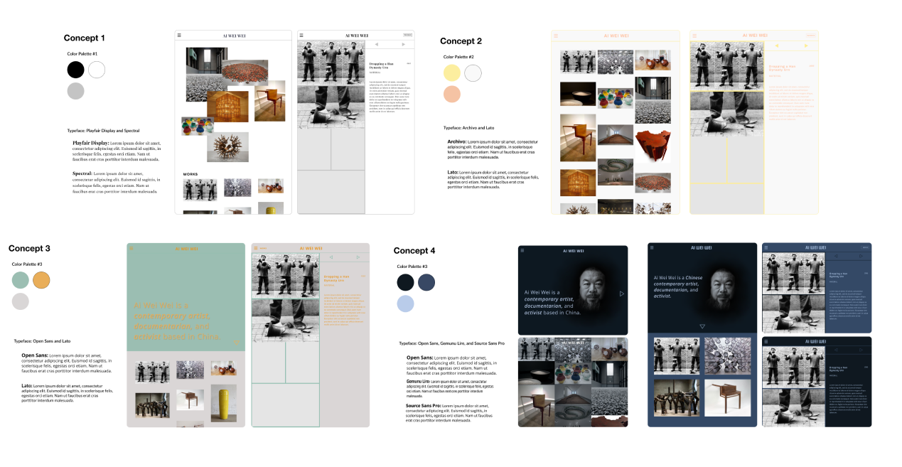
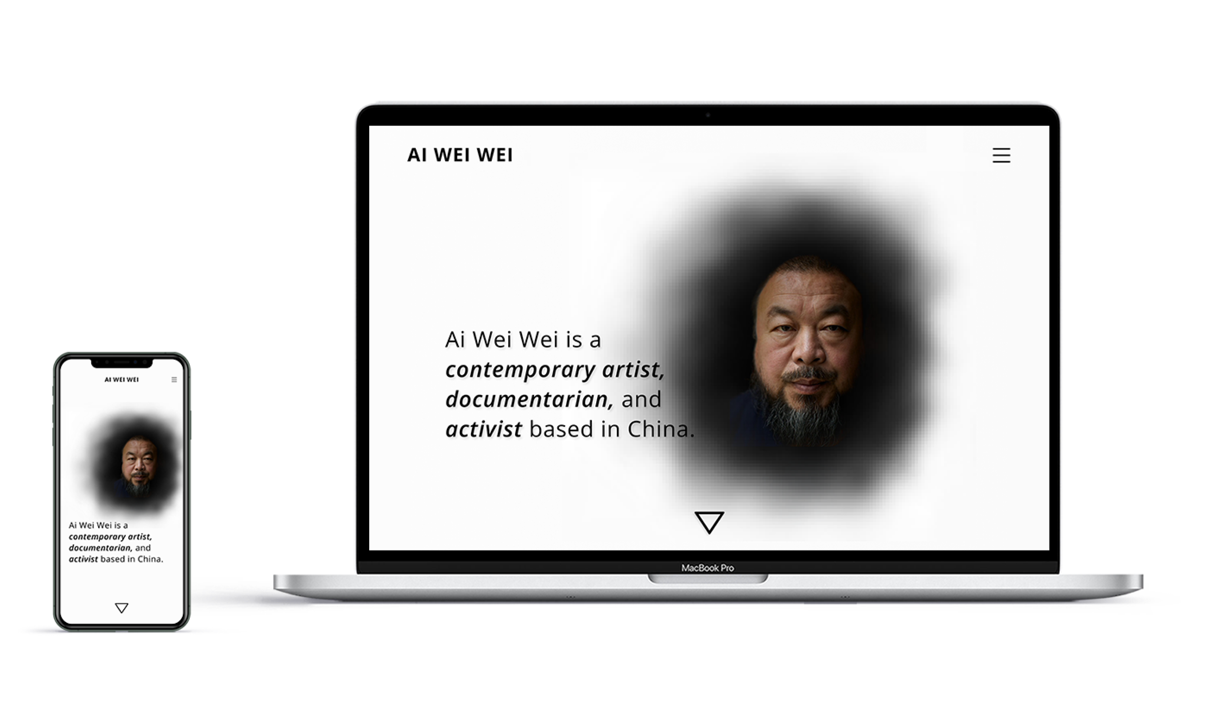
Ai Wei Wei Portfolio

Overview

This website is dedicated to showcasing the artworks of a Chinese artist who criticizes the Chinese government on its stance on democracy and human rights through his artworks. Each image is a link to a more informational page of the artwork with a description and different perspectives of the artwork. The site will also include an overview/about page.

Role

UI Designer
Art Direction

team

Me (Solo Project)

time

1 Month

tools

Figma

Problem

Ai Wei Wei often employs Chinese art forms to display Chinese political and social issues. However, he does not have a website for fans to view all of his works. Instead, they have to search for his works individually.

Solution

I aimed to provide awareness of the political and social issues addressed in Ai Wei Wei’s artworks by engaging the user through a highly visual platform, raising curiosity and thoughtfulness through concise and neutral visual language, and providing relevant data about each artwork their intentions.

Desktop

Mobile

Research

I began my design process by researching existing portfolio platforms to identify features I liked or found inconvenient as a user, and then I began planning my layouts. I specifically focused on Mikiya Kobayashi's portfolio because it emulated the modern, quiet style that I wanted in my website. I also looked at other sites such as retail sites to see how they presented their products and description.

Mikiya Kobayashi Portfolio

  • Good visual feedback
  • Users can see all of artworks at once
  • Heavy image/visual base
  • Gives many images/angles of products
  • Description follows the scroll

ETQ Amsterdam

  • Aesthetic layout
  • Many images of product
  • Shows how product interacts in its environment

Concept Sketch

Wireframes

Prototyping

Despite wanting to keep things simple and modern, it was hard to figure out how to organize all the information without being lost in translation. Through my usability testing, I was able to collect a few ideas on how to reorganize my information; however, that resulted in several more variations of the website. Along with these versions, I also explored the visual language.

Iterated Prototype for Usability Testing

Synthesis of Testing Feedbacks

Key Patterns/Trends

  • Simple, clean design
  • Lots of white spacing between images but not distracting
  • Straightforward
  • Home button is intuitive

Surprising Insights

  • Need a back button to works page
  • Description section has too much white/pos space
  • A separate work page would be nice
  • The first image fills up the space well (not distracted by other images)

Areas of Improvement for Iteration

  • Add a button that takes to works page
  • Bring arrows closer
  • Have scroll only on image side (if possible)
  • Add name overlay on images

Annotations of Changes

Visual Language Exploration

Since I wanted the app to be modern and clean, I focused more on monotone and neutral colors. I did explore a bit with some fun color palettes to see if maybe a fun tone would suit the website more.

Final Product

Style Guide

Conclusion + Reflection

Through this project, I learned a lot about the importance of designing with functionality as a priority. After doing a usability test, I realized that it is easy to forget that others would not always understand what I find is intuitive. I realized that I kept my prototype too simple that it confuses the users. Thus, user feedback is really important in drawing the designer back to reality and realizing that ideas are not always applicable.

Next time, I would like to do more field research on my artist’s artworks. Even though I did research on my artist, Ai Wei Wei, before I began, I did not know his artworks enough when selecting individual representative images of his artworks. I would also like to conduct more usability tests because I would like to get more feedback on image and color placement relations.

If I could develop the project further would be to include more of Ai Wei Wei’s works. I would also like to be more open-minded and explore a bit more with colors. Even though the current grayscale color scheme best fits the tone and style that I want, I think it would be more interesting if it included color. I would also like to add more pages to the website where it can track down news articles and exhibitions of Ai Wei Wei.

Mockups from Mockupworld