Design Decisions
Simplified window
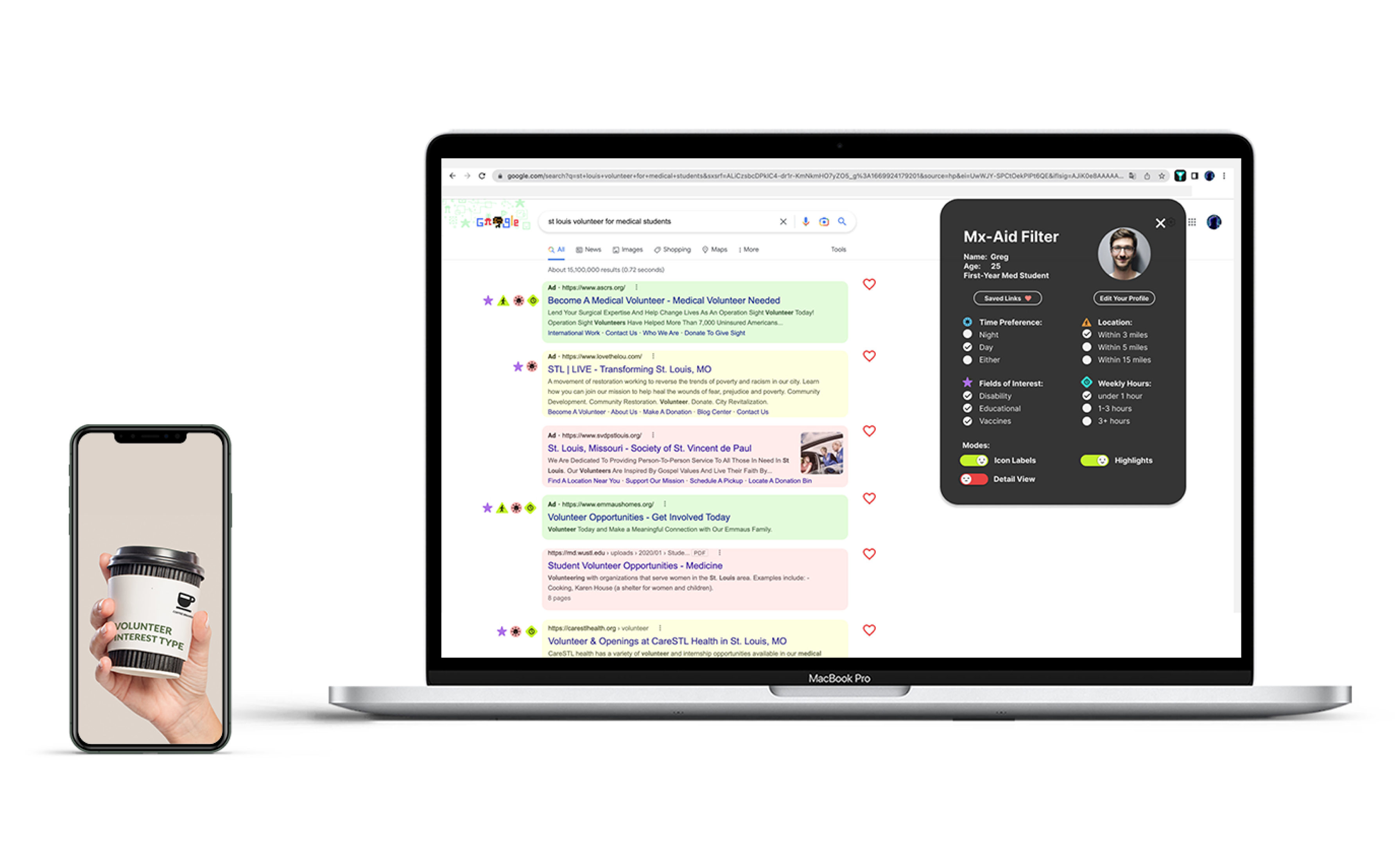
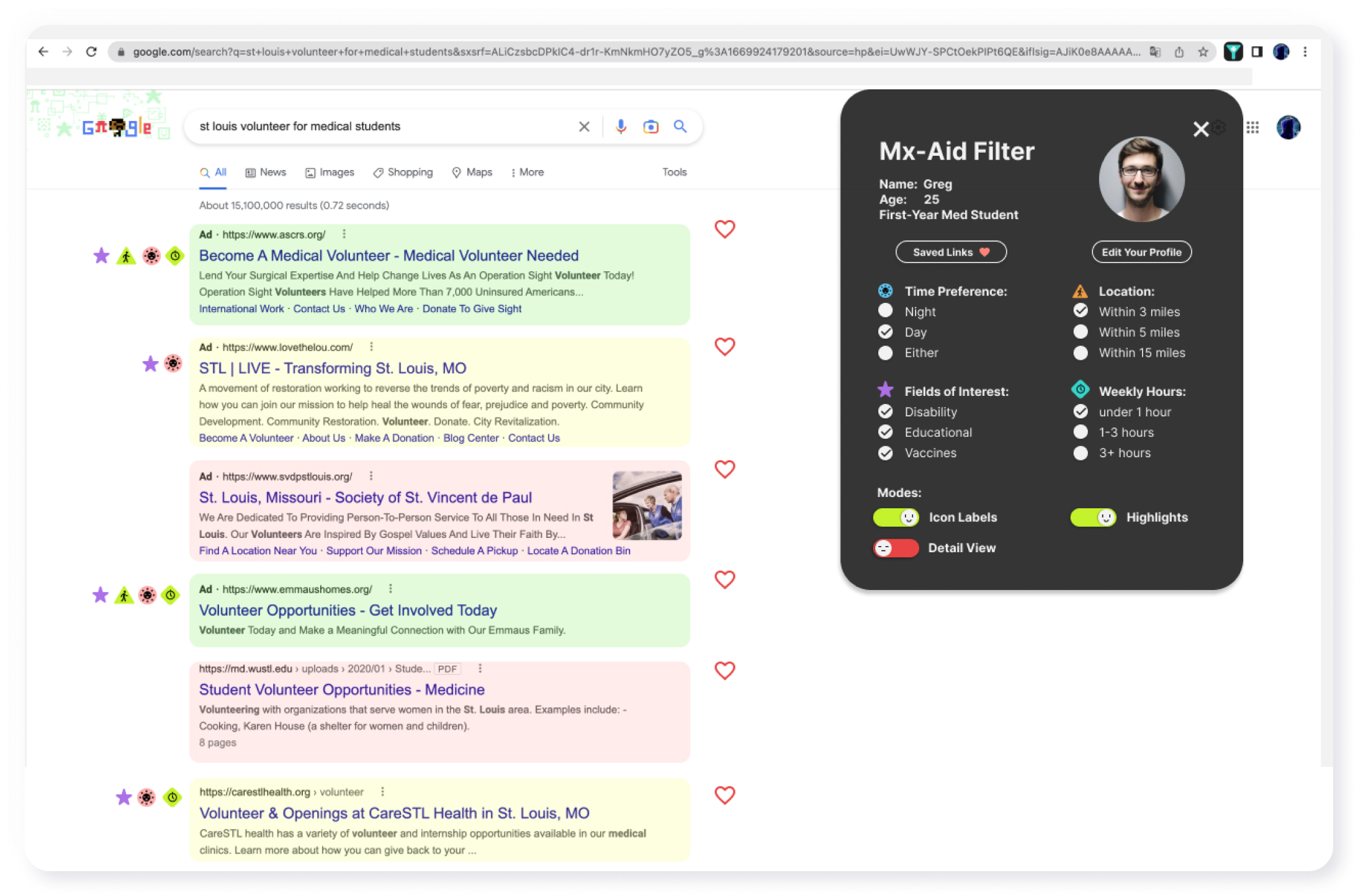
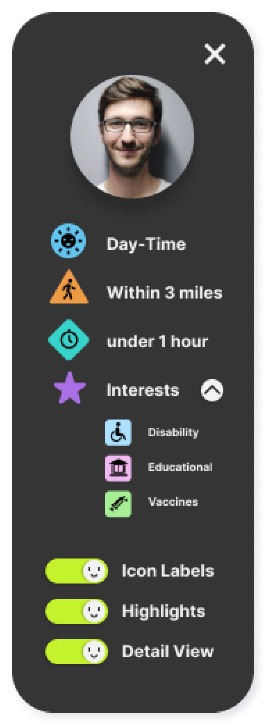
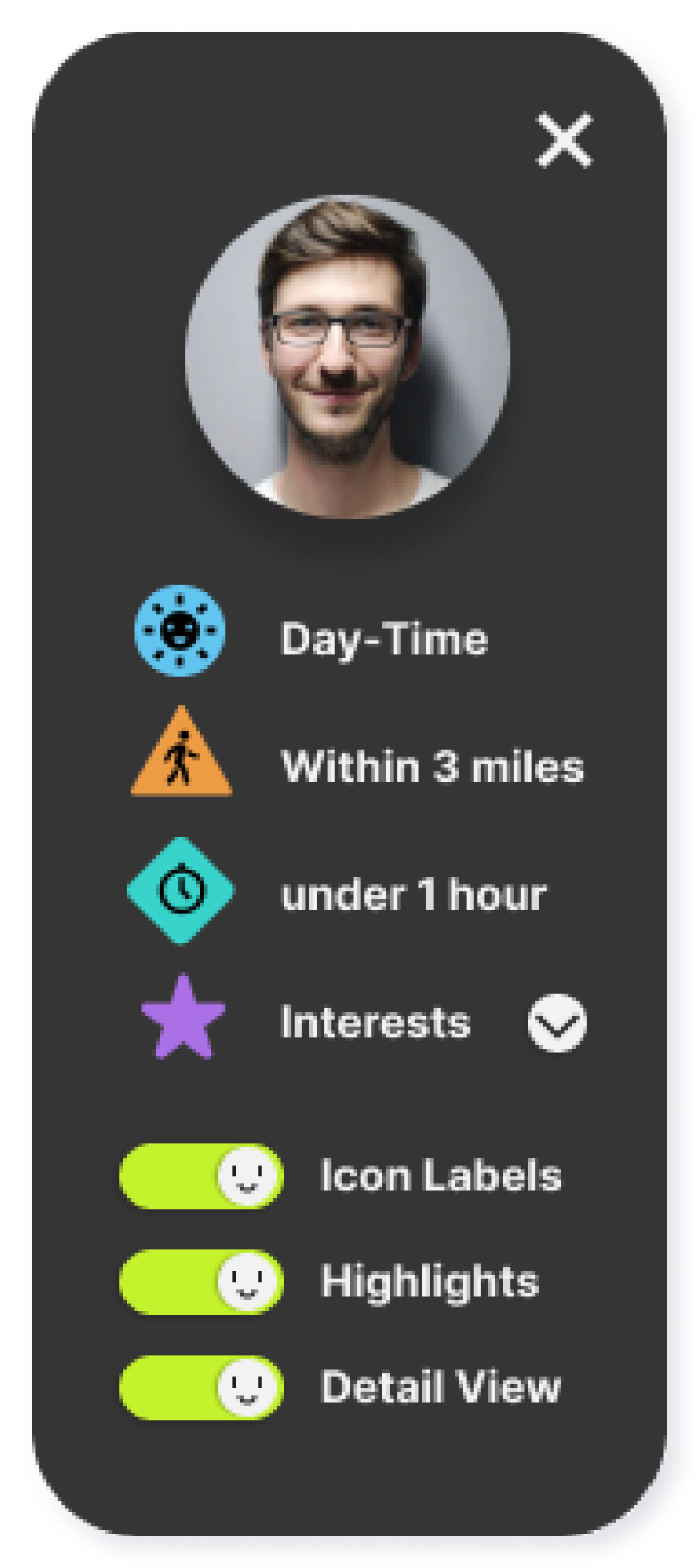
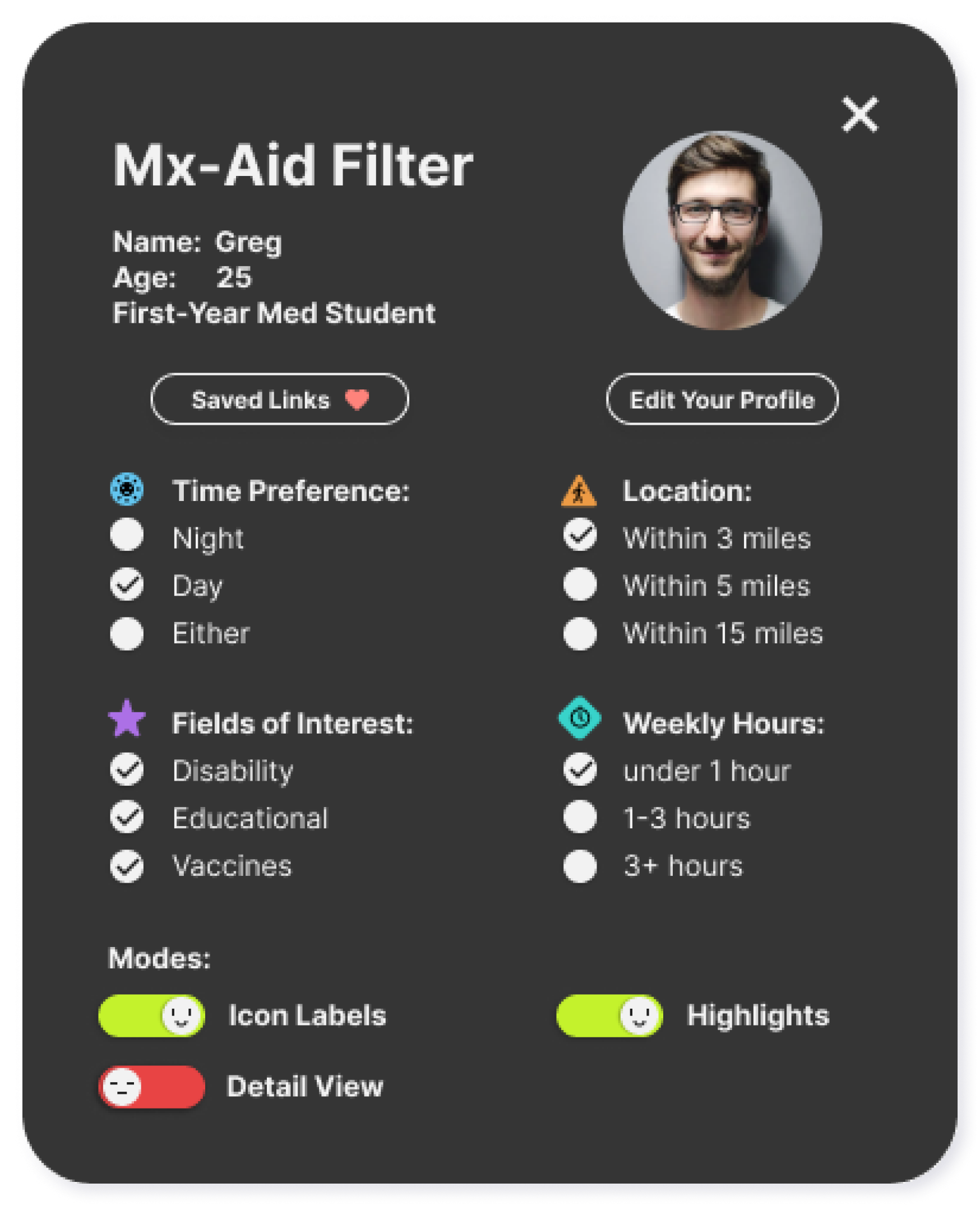
If the users don’t want to change their preferences, they can turn off the “Detail View” and it will switch to a simplified and cleaner window. They can also check their specific fields of interest by clicking the drop down button. If they want to switch back and change preferences, they can always just turn on Detail View again and switch back to the original window.
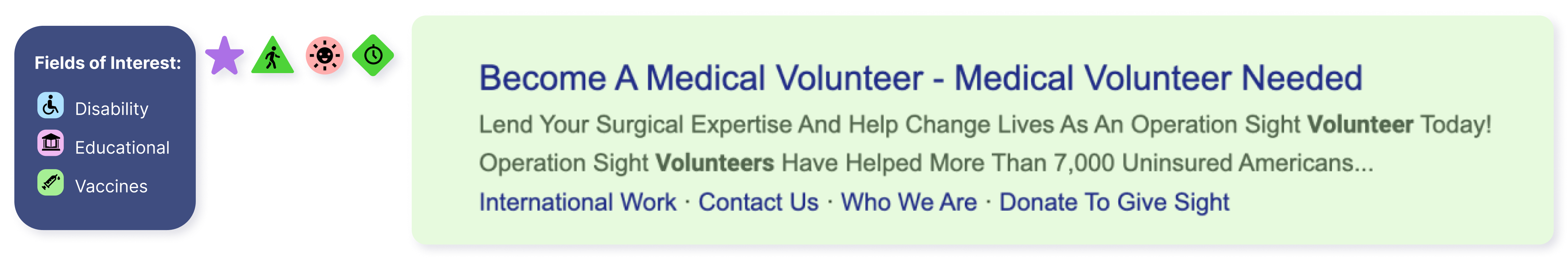
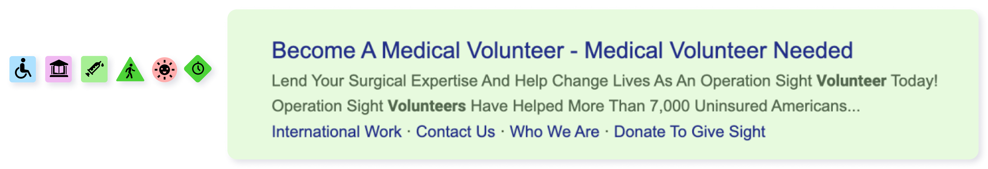
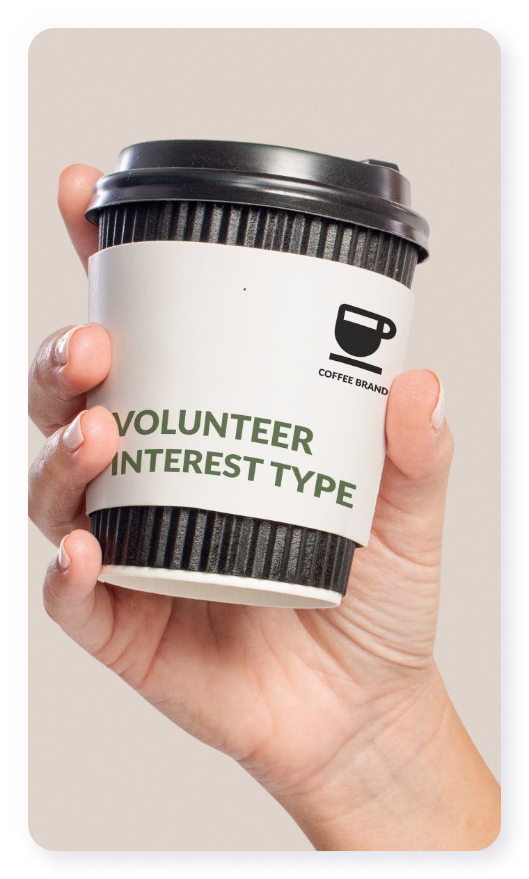
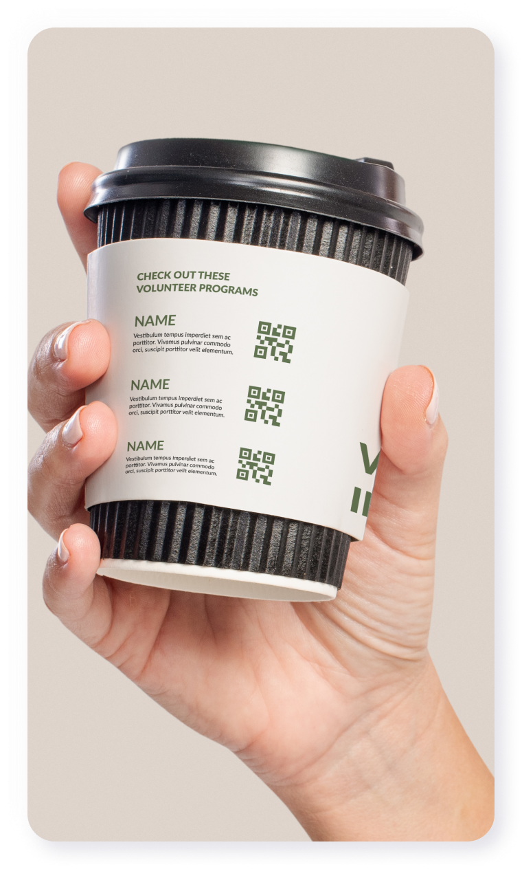
Fields of interest Icon
At first, we made several different icons for different fields of interest. However, after some interview and receiving some feedback, we realize this would potentially make too many icon labels appearing on screen, potentially overwhelm the users. Therefore, we decide to use the simple star icon to indicate the link satisfy user’s choices for fields of interest. And users can use mouse to hover above the star icon to see the details about specific fields of interest.
Highlights toggle
We have this feature quite early when Jamie created the storyboard. However, we are actually not so sure if this is necessary in the beginning, since the main idea of our chrome extension is helping users to filter links, and highlights is quite an essential part of it. However, after we test out my page color in the views of different type of colorblind (with the help of Color Blind Plugin), we realized that the highlights are almost useless and even distracting for colorblind people. We think have a toggle that can turn off the highlights will help viewers, especially colorblind users, to have a much cleaner view. And they can just simply check out the icon labels to see if the link satisfy their requirement. Also, during our interview with a medical student last week, he pointed out that even without the highlights, icon labels are very clear indicators of their preference.
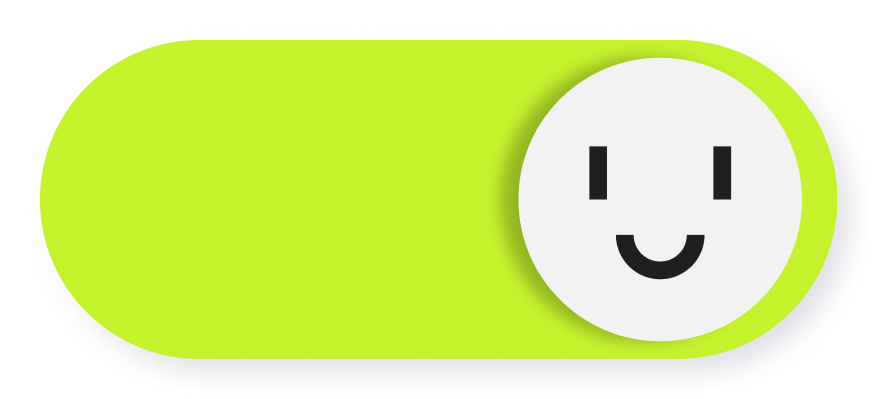
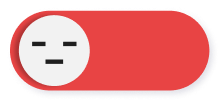
On/off Toggle
During the last-day share out, we got a comment pointing out that this on/off toggle is not quite standardized--sometimes, like the toggle we made, the circle switch on the right means it’s on, but sometimes it’s the exact opposite. In most circumstances, this isn’t an issue because we use green and red to indicate the on and off. However, in the later design process when we are thinking about accessibility and colorblind mode, this green and red would not work as a good indicator for colorblind users. Therefore, we added smiling face and emotionless/sleepy face to indicate on and off.